When you think about an album cover, what comes to mind? For many, it’s the first impression of the music contained within. The mood of an album cover plays a crucial role in setting the tone for the listener’s experience.
It serves as a visual gateway, inviting you into the world of the artist’s sound. A well-crafted cover can evoke emotions, spark curiosity, and even create a sense of nostalgia before you even press play. The mood encapsulated in the artwork can resonate with your feelings and expectations, making it an essential aspect of the overall musical journey.
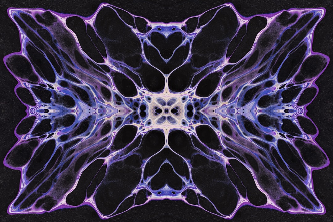
Moreover, the mood of an album cover can significantly influence your perception of the music itself. If you see a dark, brooding image, you might anticipate somber melodies or introspective lyrics. Conversely, a vibrant and colorful cover may lead you to expect upbeat rhythms and joyful themes.
This initial emotional response can shape your listening experience, making it vital for artists to carefully consider how they want their audience to feel before they dive into the tracks. In essence, the album cover is not just a decorative element; it is a powerful tool that can enhance or alter your connection to the music.
Key Takeaways
- The album cover mood sets the tone for the music and can greatly impact the listener’s perception.
- Choosing the right visual elements such as imagery and graphics can enhance the overall appeal of the album cover.
- Utilizing color and typography effectively can help convey the emotions and message of the music.
- Creating a story or concept within the album cover can add depth and intrigue for the audience.
- Incorporating symbolism and imagery can add layers of meaning and create a lasting impression for the viewer.
- Consistency with the music genre and style is crucial for ensuring that the album cover accurately represents the music it contains.
Choosing the Right Visual Elements
Selecting the right visual elements for an album cover is akin to curating a visual language that speaks to your audience. Each component—be it photographs, illustrations, or graphic designs—should align with the message you want to convey. You might find that certain images resonate more deeply with your artistic vision than others.
For instance, if your music leans towards the ethereal, incorporating dreamlike visuals can create a harmonious connection between sound and sight. On the other hand, if your style is raw and gritty, opting for stark imagery may better reflect your artistic intent. Additionally, consider how these visual elements interact with one another.
The composition of your cover should guide the viewer’s eye and create a cohesive narrative. You might choose to juxtapose contrasting images to evoke tension or harmony, depending on the themes present in your music. The arrangement of these elements can also influence how you feel about the album before even hearing a note.
By thoughtfully selecting and arranging visual components, you can create an engaging and memorable cover that captures the essence of your work.
Utilizing Color and Typography

Color and typography are two powerful tools in the realm of album cover design that can significantly impact how you perceive an artist’s work. The colors you choose can evoke specific emotions and set a particular atmosphere. For example, warm colors like reds and oranges may evoke feelings of passion and energy, while cooler tones like blues and greens can create a sense of calm or melancholy.
As you select your color palette, think about how these hues align with the themes and emotions present in your music. Typography is equally important; the font you choose can communicate a lot about your style and genre. A bold, modern typeface might suggest a contemporary sound, while a vintage script could evoke nostalgia or classic influences.
The way you arrange text on the cover also matters—consider how it interacts with other visual elements and whether it enhances or detracts from the overall design. By carefully considering both color and typography, you can create an album cover that not only looks appealing but also resonates deeply with your audience.
Creating a Story or Concept
Every great album has a story to tell, and your album cover should reflect that narrative. As you embark on this creative journey, think about the overarching themes present in your music. What message do you want to convey?
How can you visually represent that story? By creating a concept that ties together your music and artwork, you can provide listeners with a more immersive experience. This connection between sound and visuals can deepen their understanding of your work and foster a stronger emotional bond.
You might consider using imagery that symbolizes key moments or emotions from your songs. For instance, if your album explores themes of love and loss, incorporating elements that represent these experiences—such as broken hearts or serene landscapes—can enhance the storytelling aspect of your cover. Additionally, think about how the layout and design choices contribute to this narrative.
By weaving together visual elements that reflect your story, you create a cohesive experience that invites listeners to explore not just the music but also the deeper meanings behind it.
Incorporating Symbolism and Imagery
Symbolism is a powerful tool in visual storytelling, allowing you to convey complex ideas through simple images. As you design your album cover, consider what symbols resonate with your music’s themes. For example, if your songs delve into personal growth or transformation, using imagery like butterflies or blooming flowers can evoke those concepts effectively.
These symbols can serve as visual metaphors that enrich the listener’s experience and invite them to interpret the artwork in their own way. Imagery also plays a significant role in creating an emotional connection with your audience. You might choose to incorporate photographs or illustrations that evoke specific feelings or memories related to your music.
This could be anything from abstract shapes that represent chaos to serene landscapes that evoke tranquility. By thoughtfully selecting symbols and imagery that align with your artistic vision, you can create an album cover that resonates on multiple levels, encouraging listeners to engage with both the music and its visual representation.
Consistency with Music Genre and Style

Finally, ensuring consistency between your album cover and your music genre is crucial for establishing your identity as an artist. Each genre has its own visual language—what works for a heavy metal album may not resonate with fans of indie folk music. As you design your cover, consider how it aligns with genre conventions while still allowing for personal expression.
This balance will help you connect with your target audience while also showcasing your unique style. Moreover, consistency extends beyond just genre; it encompasses your overall artistic brand as well. If you’ve established a particular aesthetic in previous releases, maintaining that visual identity can help build recognition among listeners.
This doesn’t mean you can’t experiment or evolve; rather, it encourages you to find ways to incorporate new ideas while staying true to what makes your work distinct. By ensuring consistency in both music and visuals, you create a cohesive experience that resonates with fans and invites new listeners into your artistic world. In conclusion, crafting an effective album cover involves much more than simply slapping on an image; it requires thoughtful consideration of mood, visual elements, color, typography, storytelling, symbolism, and genre consistency.
Each aspect plays a vital role in shaping how listeners perceive and connect with your music. By taking the time to carefully design an album cover that reflects your artistic vision, you not only enhance the listening experience but also create a lasting impression that resonates long after the final track has played.